Represent and Partition the World: How to Overcome the North-South-Limit to Think the Inequalities of Wealth and Development
Laurent Carroué, inspecteur général de l’éducation, du sport et de la recherche, directeur de Recherche à l’IFG - université Paris VIII
Hélène Mathian, ingénieure de recherche (méthodes en analyse spatiale) - CNRS, UMR 5600 EVS
Traduction en anglais :
Charlotte Musselwhite-Schweitzer, professeure des écoles (retraitée) - académie de Rennes
 Mode zen
References | citation | Deutsch | English | français
|
The typology used in this article. To view the map in very large, click here. |
One of the fundamentals of teaching geography at secondary and university levels is to think of the world in terms of its uniqueness as well as of its diversity. This basic process calls for a necessary phase of representation and partitioning of the world. In particular, reflecting on development rests on the differentiation of wealth, or at least relative material comfort, with access to essential services and satisfaction of basic needs and, on the other hand, situations of poverty, exclusion from those services and precarity regarding the satisfaction of the most elementary human needs. The language for these descriptions often uses, quite unconsciously, terms referring to “developing countries”, “emerging countries”, ”northern” and “southern” states. This terminology is historically dated. Plus, it is always binary: two groups are automatically antagonising each other. The emergence process has seen over the past decades a part of the second group’s population getting out of precarity: all the emerging countries are classified as “southern”, although their socio-economic features have come closer to those of the “northern”, but without becoming identical. It turns out to be quite impossible for geography teachers to keep transmitting the image of a bisected world, when one of the groups contains countries as different as China, Brazil, Qatar, Uruguay, Rwanda and Madagascar.
Our starting point here is the question of development, and not of power. Development is understood as the process leading a population out of poverty, although this term has its limitations. It goes back to a historically dated vision of human progress seen as a straight line with a unique trajectory for all the countries, of which some are “advanced” and others “behind”, in the conceptual framework of an infinite growth of all riches. It is no longer possible to use this word today without questioning, on the one hand, the link between the wealth of a country and the happiness of its population, and, on the other hand, the sustainability of the model of development in the light of global environmental crises.
Of course, institutions like the UN have been advocating sustainable development for at least two decades, with their worldwide objectives (SDGs), but thus far the formula for achieving economic development without increasing pressure on the environment has not yet been found.
Whilst sustainable development remains the prerogative of the so-called developed societies, for a large part of humanity, getting out of poverty is the priority. It is much easier to claim that the survival of humankind is connected with the environmental sustainability of its choices when you live in a country where the majority of its population can largely satisfy all their basic needs. In any way, our reflection being dependent on the best available and reliable data, the matter of ecological sustainability can only be mentioned in passing, as usable and reliable statistics for each country worldwide are absent for these nevertheless crucial questions ((It is for instance difficult to find the figures for per capita CO2 emissions which would account for imported emissions, ie emissions produced abroad in order to satisfy the domestic consumption needs of a country.)).
The aim of this article is to suggest an innovative and operational partitioning of the world regarding the level of economic and human development as objectively as possible. We insist as much on the method we used to get results as on the results themselves, as it is all about getting out of the “North-South” pattern which has anyway left the history of development by the back door. Of course, each construct can be deconstructed and subjected to debate, and so can be ours here. Our aim is not only to open the way for reflection, but also to achieve an operational result.
1. Which conceptual framework to think and characterize development?
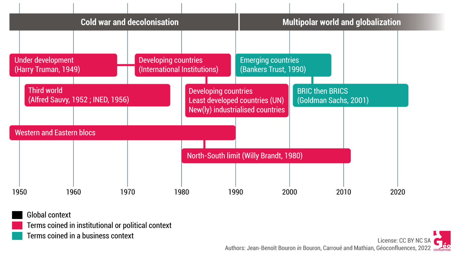
The question of which conceptual toolkit to use to analyse development is a good example for how new words are created and how they have historically evolved, as well as the political, ideological and geopolitical issues they convey in the context of the actual debates (Carroué, 2019, 2020). The North-South concept is the result of a unique historical process. The words used to describe the inequalities of development are heavily charged and, without stating that they are performative or express self-fulfilling prophesies, they say a lot about the way the global social and economic order is viewed.
1.1. The question of development: a historically anchored terminology
The term of “under development” was introduced by US-President Harry S. Truman on January 20, 1949, in point 4 of his “State of the Union Address” within an aid plan towards the underdeveloped countries which he wanted to integrate into the sphere of Western influence: “We must embark on a bold new program for making the benefits of our scientific advances and industrial progress available for the improvement and growth of underdeveloped areas.” His objective was to present the American way of life as a universal model against the Soviet communist model which had gathered prestige at the end of the Second World War, at a point in time when the Cold War was already very hot and China was tipping with Mao’s assumption of power.
The term of “Third World” (tiers-monde) was then coined by French demographer Alfred Sauvy in the pages of the French weekly L’Observateur, in August 1952, with an explicit reference to the “Third State” of the French revolution and to the formula used then by Abbé Sieyès: “… because finally this Third World, ignored, exploited, despised, just like the third state, wants to become something too” (Sauvy, 1952). It was very successful and soon used at the Bandung Conference of 1955 in an attempt to refute the logic of bipolarisation introduced by the Cold War, within the movement of decolonisation and the rise of the non-aligned States. The expression is then picked up by a publication of the Institut national d’études démographiques (INED – French state institute for demographic studies) in 1956. It became a major key for understanding the world order, politically as well as economically, and achieved its own autonomy, away from the initial context and the objectives of its creator.
The term of “emerging countries” appeared after the 1973 crisis in the debates over a necessary “new economic world order”. It is widely used by certain international institutions of the UN-system (FAO, UNCTAD, ILO, WHO). It was generally admitted that the poor countries were engaged on a path of economic catch-up in a similar way as it had been observed in the industrialised countries in the previous period. In the 1980’s, additional terms came up, like “developing countries”, “less advanced countries”, “new(ly) industrialised/industrialising countries” (NICs).
1.2. The North-South divide to overcome the East-West antagonism
The “North”-”South” divide appears in 1980 in a report on development problems with the title of North/South: a Programme for survival, chaired by the German social democrat Willy Brandt (document 1). To him, the North-South divide had become more potent than the East-West antagonism left by the Cold War (Capdepuy, 2007). The North encompassed the large dominating entities (United States-Canada, Western Europe, Japan and, to a lesser degree, Central and Eastern Europe and USSR) as well as their annexes in the southern hemisphere (Australia and New Zealand). The South comprised the economically and politically dominated peripheries of Asia, Africa and Latin America. The North-South fracture is a photograph of the economic, demographic and social differentials of that era, as well as a panorama of the political and geopolitical power relations.
Document 1. The North-South Limit as represented on the cover of the Brandt Report (French version, 1980)
|
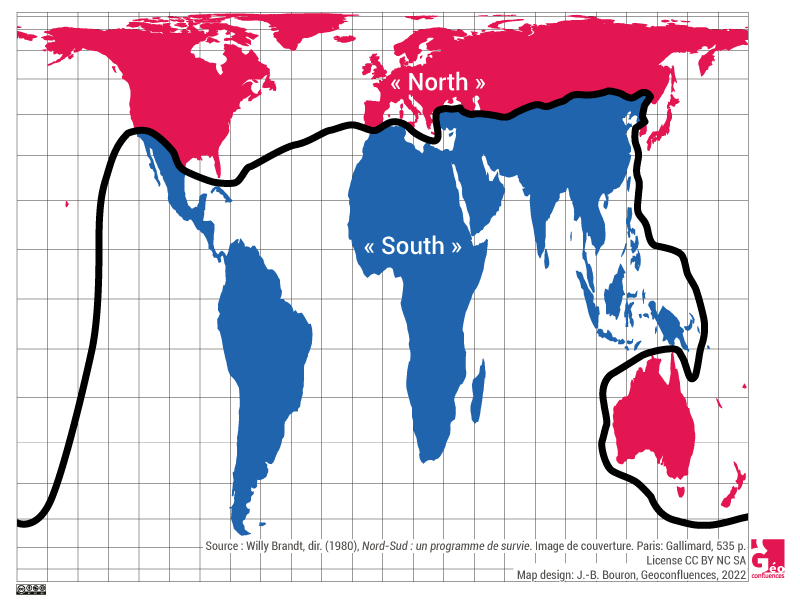
Contrasting a perspective of human progress which underlies the term of ”developing country”, the North-South dualism tended to freeze an existing situation: it was no longer certain that a country of the “South” could ever join the “North”, even more so as the use of the cardinal points or the names of the hemispheres, though being rhetorical, linked the formula to an immovable natural order (Dufour, 2007). In the decade that followed its invention, combined with the break-up of the East-West divide, this picture of a world split up into North and South became hegemonic, especially in school geography, but also in the greater public, until the beginning of the 2010’s. Maintaining the concept only needed a few detours within the limiting line – which are eminently symbolic and symptomatical themselves – to encompass Israel or Singapore, but never the oil monarchies of the Persian Gulf for example. During the following decade the term slowly fell into disuse because of the increasing criticism it raised, particularly amongst geographers like Christian Grataloup (2015). Using it in plural form and with inverted commas has only prolonged the use of the term in common language, but in education, it was taught only to be criticised.
1.3. The anglophone business bankers have the word: when finance names development
It is mainly when the term of “emergence” became predominant, first identified in the field of financial markets (Montalieu, 2019), that the bisected world order of the “North-South limit” was shaken up.
The term of “emerging countries” appeared in fact at the beginning of the 1990’s from the mouth of the financier Antoine van Agtmael of the New York Bankers Trust to name the new investment locations. It was swiftly picked up and spread around by the World Bank which distinguished depressed areas (especially those which suffered a “lost decade” in Africa or Latin America) from countries experiencing an economic take-off (Brazil, Mexico, South Korea, China …). The term is used today in a geopolitical context to define States which are growing into world, continental or regional powers.
The acronym BRIC (Brazil, Russia, India, China), then BRICS (with South Africa), came up in November 2011, coined by the financier Jim O’Neill, chief economist of the American business bank Goldman Sachs in New York, to identify a new group of countries in which to invest, focussing on the demographic and economic weight of these as well as their dynamics (40% of the world population, 16% of the global GNP).
This brief excursion into language history shows the discontinuities in the production of concepts to reflect and analyse development. In the years from 1950 to 1980, they were created by politicians (Harry Truman, Willy Brandt), or social scientists (Alfred Sauvy), whereas it has been the big North American business banks and more widely, Anglo-American financial capital which took it up in 1990-2000. This demonstrates the vitality and attraction of US soft power. It invites us to apply a minimum of critical assessment in the way this terminology is being used: after all, do we really need to look at the world in the same way as a New York business banker?
Document 2. The terminology used to divide the world in terms of development gaps, 1949 – 2022
|
2. Which indicators to evaluate wealth and development?
There are no proper world statistics as such, rather more international ones: they are in fact compilations of national statistics, put together by international organisations. But a large number of indicators are available to study economic and human development, the very first being the Human Development Index (HDI), the most commonly used and without doubt the most complete. It can be mapped according to World Bank data, showing a gradient of development, a transposition onto a map of the ranking of every country regards human development, from Norway to Niger. We did not take that route for the following reasons.
2.1. The tricky use of standard indicators built by international institutions
We think that not enough care is applied when it comes to the reliability of world data given by international institutions. We do not challenge that they are constructed with the greatest care and with a definite effort to maintain objectivity, but their use should always include a critical assessment of the conditions under which they have been produced. World data are compilations of national censuses and, depending on the countries, they have been produced under very unequal conditions, according to vastly variable time scales and with very diverse procedures, and have then been corrected and harmonised with each other, sometimes completed with projections where no recent data were available. These projections can sometimes stretch over decades: in certain cities of sub-Saharan Africa the last reliable censuses date back forty to fifty years.
The phenomenon is amplified when one uses composite indicators based on several other data. So, the HDI is nothing but a statistical construct, however interesting, useful and fruitful. We do not challenge its use, but prefer staying clear, as much as possible, of composite indicators (HDI, multidimensional poverty rate, Gini Index …) and are striving to combine, wherever possible, raw data.
Many indicators have proved unusable in the course of our work, once the available data were analysed. In many cases, the international institutions like the World Bank or the UN suggest one item of data for all the countries, but “at the latest available date”. This has considerable methodological effects. For instance, during the time of our research, 2022, the same table incorporated data from 2014 to 2020, spanning a period of six years.
In some instances, the gap can be even bigger: in one of the UN tables, a piece of data was available for all the countries in the world, generally of 2019 or 2020, but the latest available data for Afghanistan went back to 1978! One understands that it is difficult to create a map of the world which would be a statistical snapshot and not a compilation of projections. Regarding all the indicators that we have scrutinised for this article, we have chosen to keep all the data from 2014 or after, and have considered any previous data as an absence of data.
The choice of indicators always conveys a vision of the world, starting with the fact that the availability of data depends on the wish of the international institutions to study a specific question, often based upon the preconceptions that the people who work in the statistical offices may have, and also according to the concerns of the member States’ representatives. The gross domestic product (GDP) or the infant mortality are these institutions’ preferred indicators, and it is easy to find recent data for a large number of countries.
Certain essential parameters of sustainable development can unfortunately not be accounted for because of the absence of reliable data. The ability of a population to live on Earth without consuming more resources than necessary, or the survival of ecosystems in every State, or the adaptation to global changes are three such examples representing the statistical challenges of tomorrow requiring new tools which are currently out of reach. By using the available indicators like the quite controversial GDP, we are aware that we shy away from a large part of what should be a measure of development, because of the lack of reliable worldwide data. This remains a field to explore in order to get out of a paradigm of “development” that has shown its limitations.
2.2. Seven indicators to measure poverty, wealth and inequalities
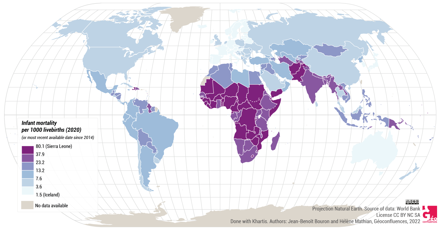
To evaluate poverty, none of the standard indicators (like the poverty rate at $1.90) was usable due to obsolete or missing data for too large a number of countries. Two indicators have been chosen: the female fertility rate and infant mortality, because they are clearly correlated with poverty: the poorer the country, the higher they are. Infant mortality rates also allow identification of a wealthy country where part of the population has only poor access to preventative care systems due to a strong inner polarisation, like the USA (ranking at place 49, behind Serbia and Uruguay and before Antigua and Barbuda and China).
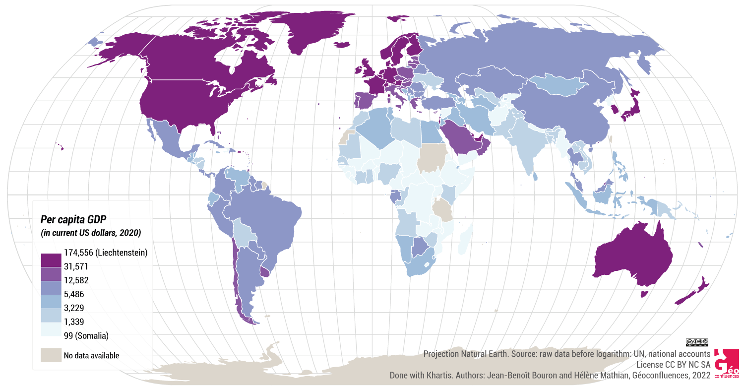
Regarding wealth and inequalities, the per capita GDP in constant dollars is the rawest data to be found, even if it remains a quite elaborate and complex construct (Mautin, 1996) the limitations of which are known, especially in matters of development (Hugon, 2005). Always bearing in mind to use the least possible transformed indicators, we preferred comparing the GDPs in constant and not in today’s dollars, and without smoothing them by the purchasing power parity. This indicator will be used here in its logarithmic form. This transformation is necessary when one works with values that present two characteristics: a very different scale (the lowest GDP being worth 100, the highest 175,000); a very unequal distribution with strong concentrations of low values on one side, and widely dispersed high values on the other (typical distribution of wealth). This logarithmic transformation allows the correction of these major differentiations to better reveal the differences, even within the lower values.
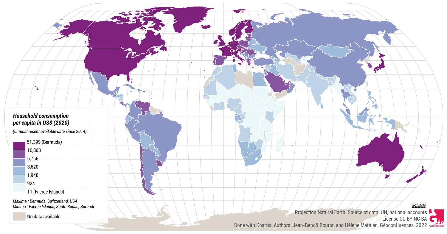
We complement the per capita GDP with two more measures: the household consumption (in dollars per inhabitant) on one hand, which allows the measure of actual access of the population to the wealth of the country, and on the other hand, the gross fixed capital formation (also in dollars per inhabitant) which indicates the real capacity of a country to generate investments. In the following, we will, respectively, use the simpler terms of “consumption” and “investment”. We don’t think that the fact that you can buy three televisions or three cars per family is necessarily an indicator for the general well-being, but, on a global scale, the per capita consumption reflects nevertheless the capacity of a population to access at least the basic needs, food in particular.
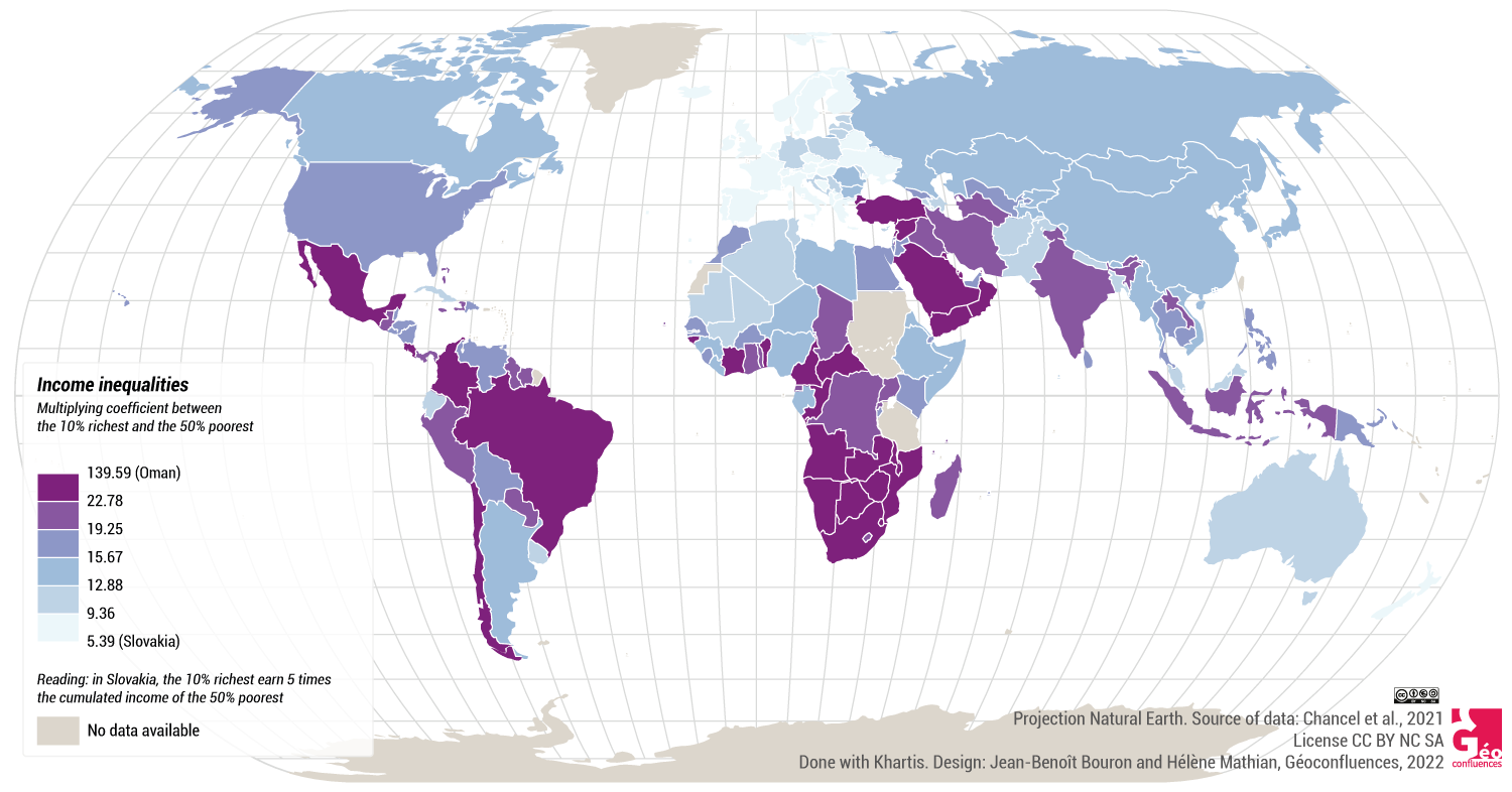
Even if these indicators show forms of inequalities, they still underestimate too much the inner inequalities of the States. There are suggestions for mapping world indicators on a sub-national scale (Didelon et al., 2017), but it will still be necessary to build operational indicators for that scale. We have thus chosen to add a composite indicator, built from other data: the income gap between the 10% wealthiest and the 50% poorest (more or less the principle of the Palma Ratio), taken from a global report on inequality (Chancel, 2021).
The rate of girls out of secondary school is a data that was used in the beginning, but then abandoned due to its absence from too large a number of countries, which would have led to the removal of these countries from our study altogether.
All the indicators used are relative to the population, for our goal, here, is not to observe the economic power or the weight of the countries, but their capacity to ensure the well-being of their population and the quality of their social reproduction (health, prevention, education …): our intention is to work on the development and not on the power or the “weight” of each State.
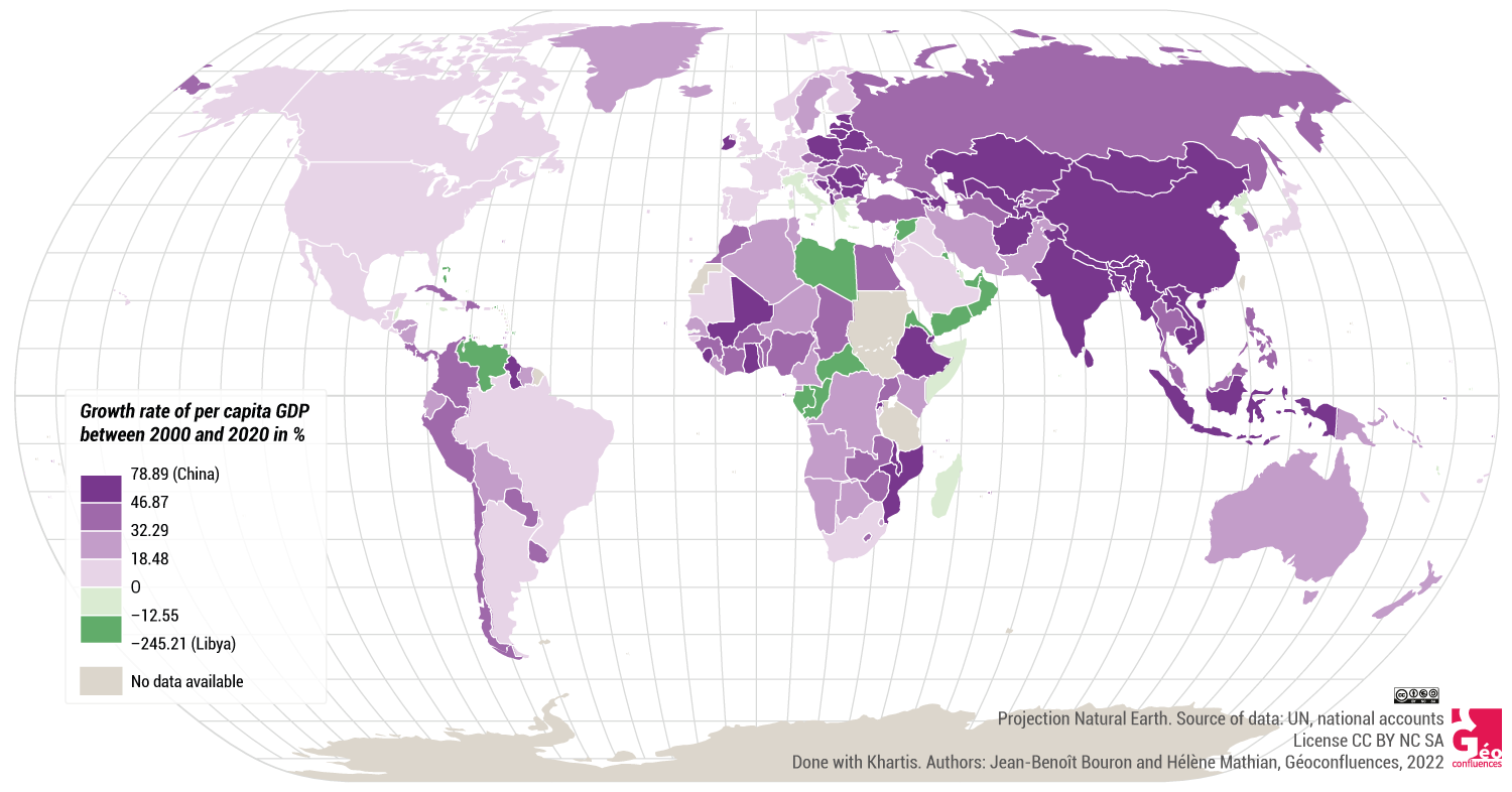
To introduce a dimension of time, we have worked with two dates for the per capita GDP, set apart by twenty years: 2000 and 2020. We have then kept the data of 2020, and added one figure that incorporates the difference between the two dates, i.e. the percentage of per capita growth between 2000 and 2020. This data promotes statistically the countries with a lower GDP in 2000, because it is easier to gain strong increase ratios on initially low values. For instance, the Czech Republic, which featured in 2000 a per capita GDP 30% lower than Saudi Arabia ($12,300 against $17,700), overtook the latter in 2020 ($18,966 against $18,691). It thus had a stronger per capita growth of GDP over twenty years. In the same way, the gross fixed capital formation has been averaged over the last ten years. This allows comparison between countries by spreading massive one-time investments, like big mining projects in thinly populated countries.
The mapping of each of the variables shows the strong tendencies of the world’s organisation, but also the variability of these tendencies (document 3).
Document 3. The seven chosen indicators |
|
|
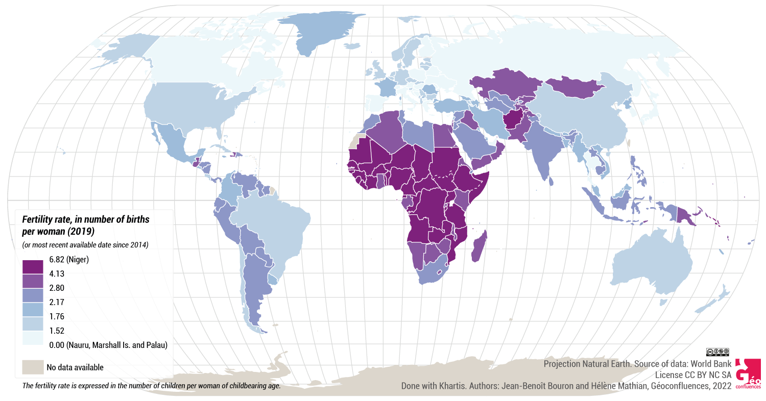
Fertility rate, in number of births per woman (2019)
|
Infant mortality per 1000 livebirths (2020)
|
|
Per capita GDP (in current US dollars, 2020)
|
Growth rate of per capita GDP between 2000 and 2020 in%
|
|
Household consumption per capita in US $ (2020)
|
Gross fixed capital formation per capita in US $ (ten year average)
|
|
Income gap between the 10% richest and the 50% poorest
|
|

2.3. Data mining
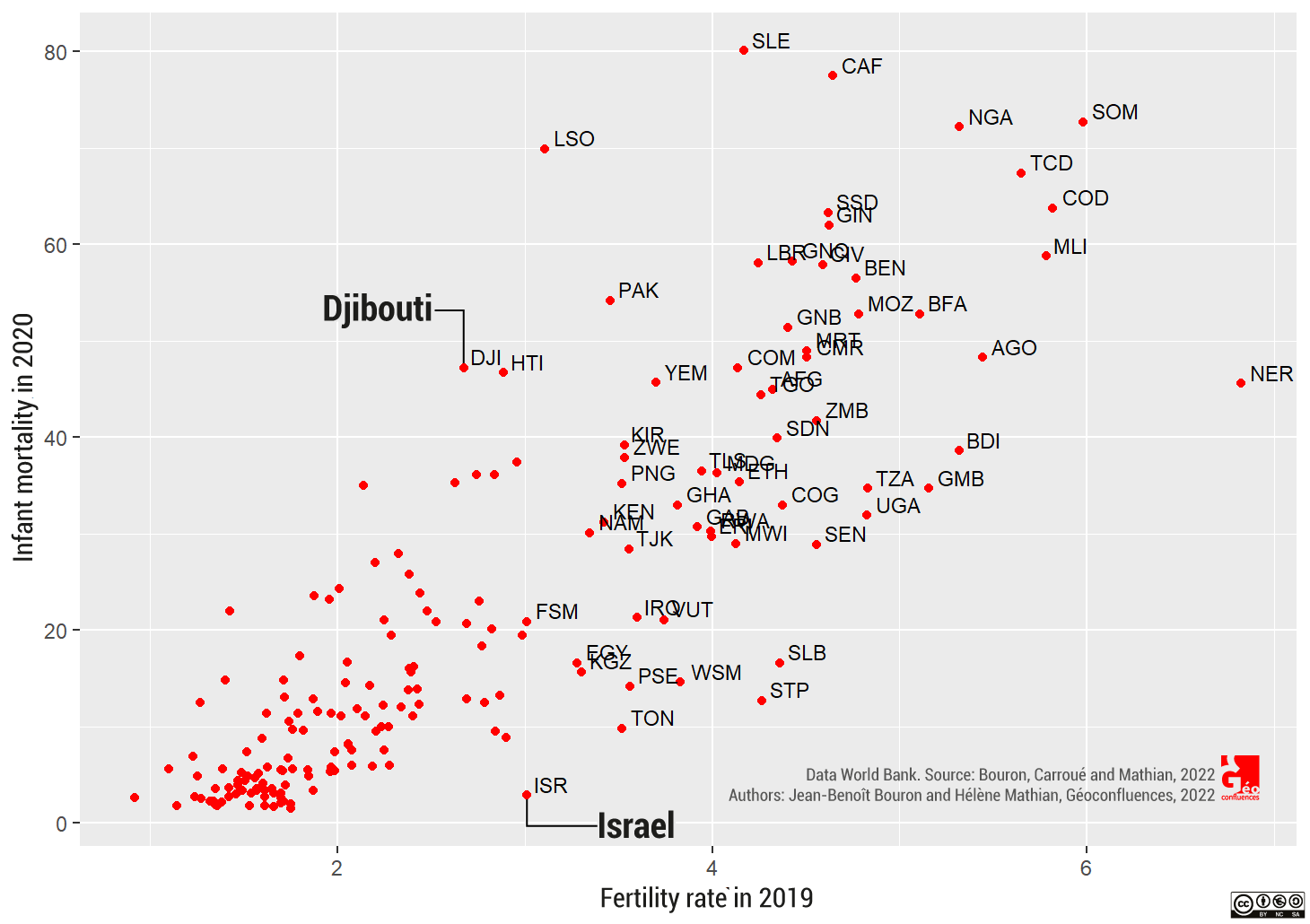
The goal is to identify the manner in which the countries are organised around the above presented variables, and to synthesize the differences of the profiles observed on the maps. The maps show coincidences that can be explained by looking at them two by two. One observes notable statistical similarities between infant mortality and fertility, and between household consumption and gross capital formation. These similarities are connected to covariations, as illustrated by the diagram in document 4a for the fertility rate (horizontal axis) and the infant mortality rate (vertical axis). The cloud of dots indicates a strong relationship. The interpretation of these relations is quite banal because they are to be expected. Nevertheless, the positions of some countries sometimes show an unexpected variability in this statistical relation, for instance in the very different infant mortality rates at equivalent fertility rates: the case of Israel and Djibouti on document 4a.
Document 4. Bivariate analysis: relations between indicators taken two by two |
|
|
4a. Strong relation between fertility and infant mortality rate
|
4b. Strong inverse relation between infant mortality and per capita GDP on a logarithmic scale
|
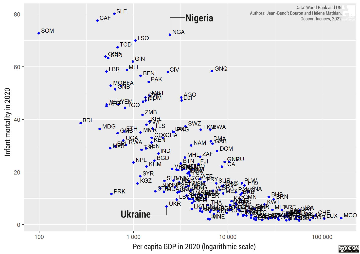
The infant mortality in 2020 and the GDP of the same year show an example of inverse relation. The two indicators are very strongly connected but in a negative manner (R = –0,78). One can link the infant mortality to the quality of the health and social protection system, thus to the way wealth is invested and distributed in that area. Document 4b shows that at equal GDP, one can observe a strong diversity of cases, as in Ukraine, where infant mortality is very low and Nigeria, where this figure is much higher despite what one would have expected from this country’s wealth.
Eventually, there is also the case of no relation between the indicators: for instance, the per capita GDP growth rate over twenty years which is correlated with no other indicator: one can have a weak growth rate, even a negative one, being either very rich or very poor.
Of these examples of the relations between two indicators, three elements should be considered to understand the difficulty of our goal, which is to categorise the countries according to their differences and similarities in seven indicators:
- The first element is that, from the point of the relationships between the seven indicators taken two by two, all three cases are possible: strong positive, strong negative and absence of relation. It is not possible therefore to simply summarise the structure of all of these indicators which could then underly the sought-after categorisation.
- The second element is that if there exists globally a simple relationship between two indicators, there will still be a certain local variability around it. The position of the countries therefore varies from one relationship to another and quickly appears to be unique.
- The third element is that one observes, on each illustration of a relationship, a continuum of situations and that nothing predicts that it is possible to “put the countries into classes”, although this is our goal.
The following statistical treatment has not been produced starting with the seven presented indicators: it has been tested numerous times, certain indicators have been added, others removed. We present the result as well as the procedure that has led to it, starting with the selected seven indicators, but it is also the result of a procedure that consists of the repeated exploring of a large number of indicator bundles.
To produce these categories, the used analysis is a multivariate method of the family of
“data analyses”, the Ascending Hierarchical Classification (AHC) ((It is an AHC on all the factors coming from an principal component analysis (PCA).)). This method allows one to “classify/sort” the elements (here the countries) described by several indicators (here seven). It is a geometrical method facilitating simultaneous studies of the similarities and the differences between countries on the basis of several indicators. The similarities and the differences are evaluated by the distances between the represented countries in a mathematical space having as many dimensions as the number of indicators. The method regroups bit by bit the close countries, i.e. the ones that are the most similar according to the seven indicators, maintaining at the same time a good differentiation between the classes.
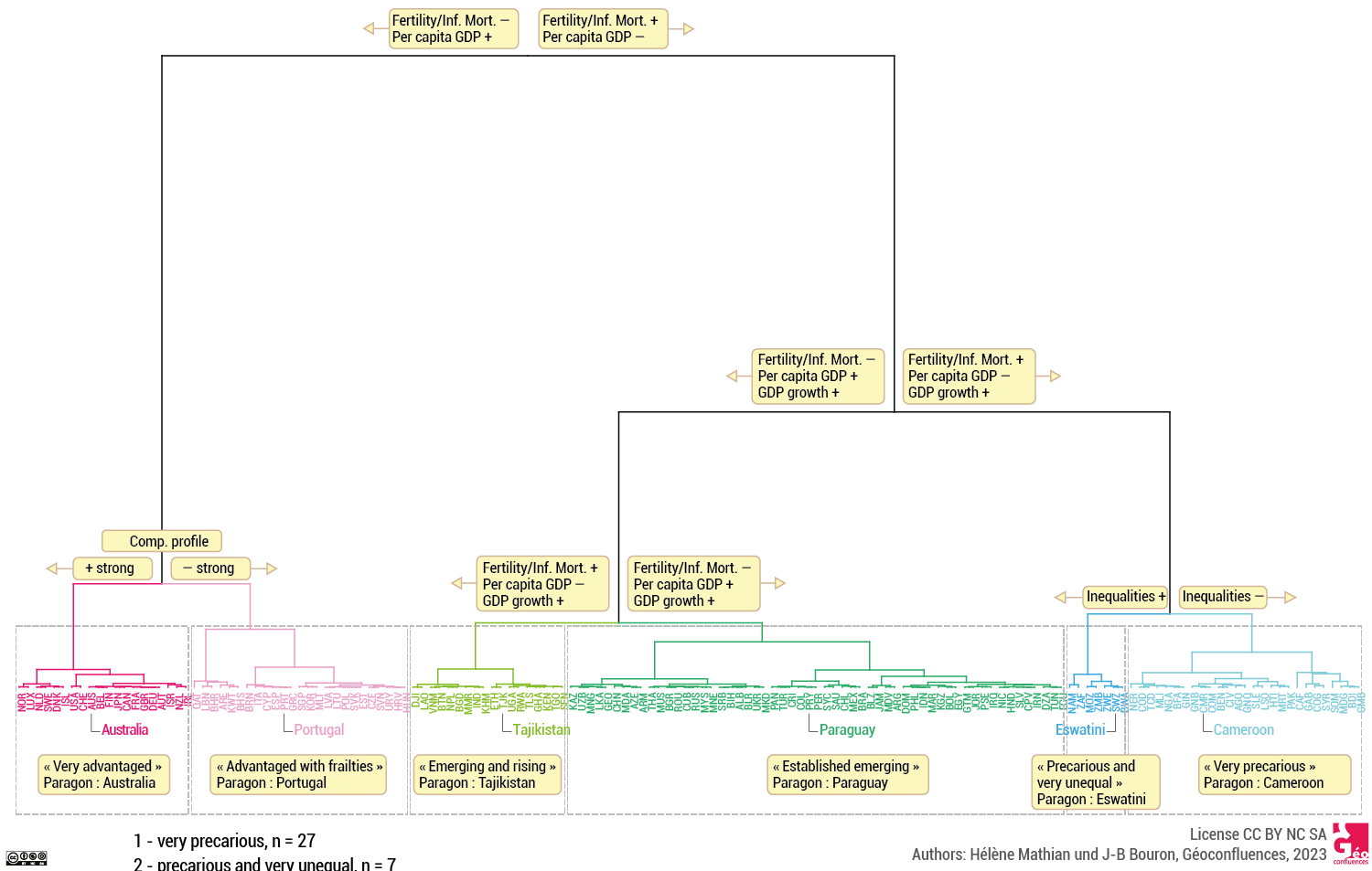
This produces a hierarchical classification tree (or dendrogram) which describes the process of these clusterings step by step. We base ourselves on this tree to select a cutting point (document 5). Depending on at which level one cuts the tree, one obtains more or fewer categories. It is all about finding the best compromise between a large number of classes giving a better reflection of the diversity of the observed situations, but where nuances would be difficult to see, and too small a number of classes which would reduce the differences to a few archetypes. There is no such thing as the “right place” to cut. And, following the third observation above, one needs to remember when it comes to interpreting the classes, that the distribution of the States along the seven indicators is a continuum, and, as it is the case in a univariate discretization, the cutting up sorts the classes in categories, and the method can separate into two different classes those elements that appear to be close.
Document 5. Dendrogram representing the ascending hierarchical classification
|
In the following we present the results of this algorithm. They stem from a certain number of choices (selection of variables, choice of the algorithm) that have been tested. The result is a reading of a reality (among all the observable realities possible) allowing the interpretation of the gaps in wealth and development throughout the world.
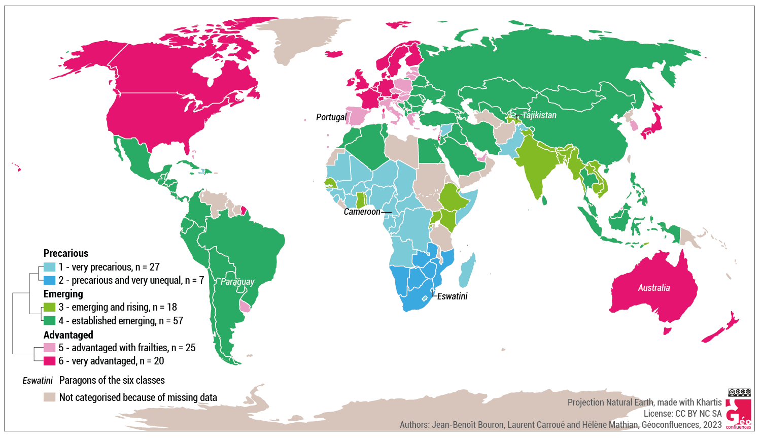
3. Proposing a new typology: three worlds, six groups
Starting with the hierarchic tree (document 5), we propose a first typology of the countries that corresponds to a partitioning of the world in six classes of which each contains between seven and fifty-four countries (document 6). In total, 154 States of 194 have been classified, due to at least one missing or unusable data for about forty countries.
3.1. A world of six classes of countries
Document 6. Presentation of the chosen six classes
|
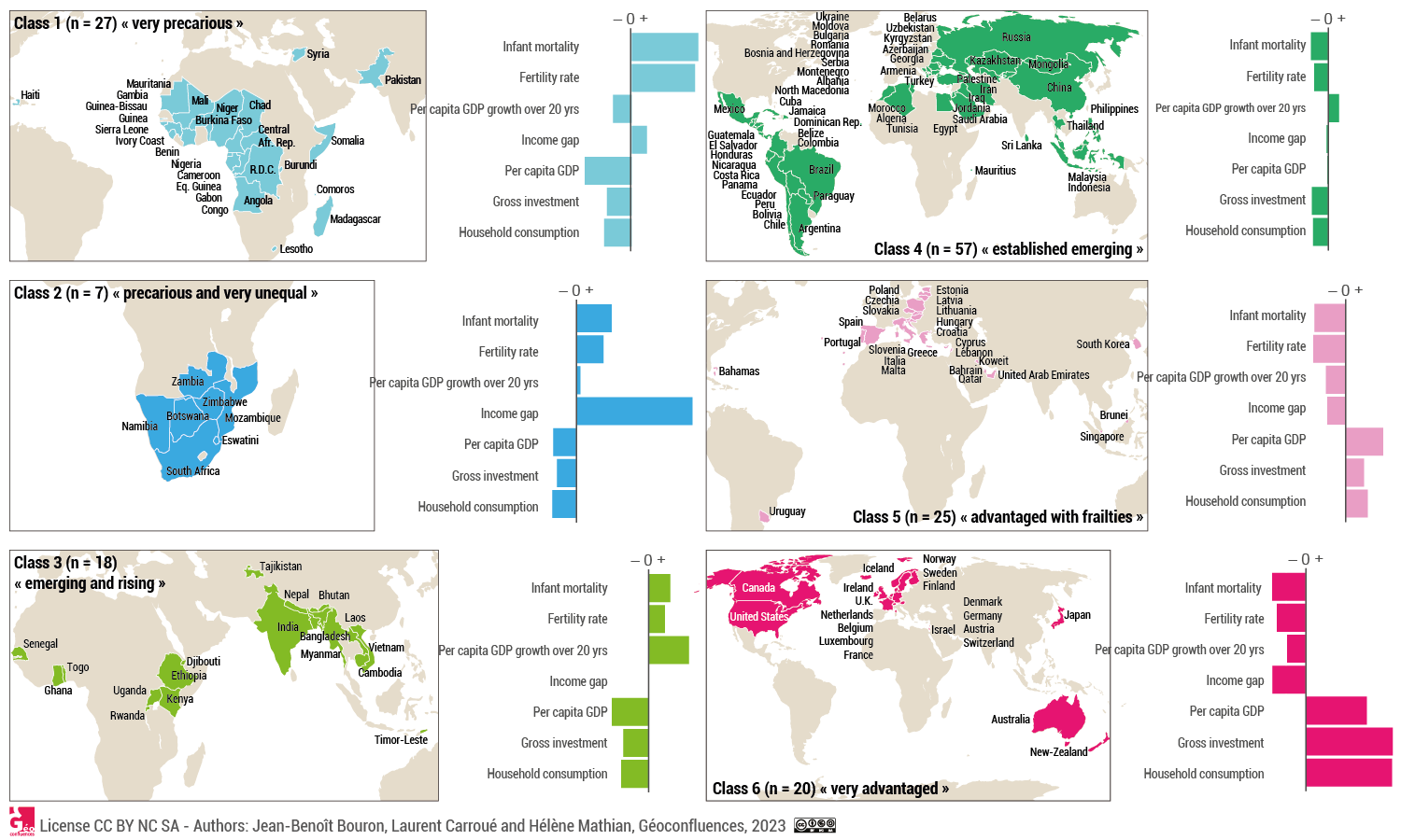
The States are pooled in six classes according to the values of the seven indicators and in such a way that each country is, on average, “closer” to the countries of the same class than the whole of the countries of another class. For each class you can identify a “paragon”, meaning the most typical State of the group regarding the value of the seven indicators. In other words, it is the group of seven States whose profile is the most similar to the profile of one of the groups as indicated on the above document (document 6).
From the profiles of these six groups, we can clearly make out three large groups. We have then to name them by using the whole of their features obtained by the analysis of the seven indicators. The word chosen for the countries of classes 1 and 2 comes from social geography: precarity names a situation of frailty in the face of difficulties and hazards. For the classes of 5 and 6, we have used a term more frequently applied to finer scales: advantaged. It accounts for a situation of affluence and development which results from inherited wealth. And eventually, there is no more appropriate term than “emerging” for the States of classes 3 and 4, because their features are very much those found in the process described as the “emergence”: increase of per capita wealth, decline of demographic poverty markers, but still with internal inequalities at a high level.
3.2. Two classes of precarious States
The classes 1 and 2 match two groups of precarious States (documents 6 and 7).
Class 1 contains twenty-seven States which qualify as “very precarious”. Their paragon is Cameroon. They have the highest fertility and infant mortality rates, and their per capita DGP is the lowest. The income inequalities there are higher than in the rich countries, but less so than in the emerging countries. The average per capita GDP increase over twenty years is lower than in all the other groups except the two groups of wealthy countries, but not for the same reason, as the starting figures are very different: Angola (class 1) and Israel (class 6) have the same per capita growth of GDP over twenty years (+23,9% and +23,8%), but in 2000 Angola had a per capita GDP of $3,214 against $39, 912 for Israel. This low growth of per capita GDP over twenty years (+17% on average for class 1, against +29% for all the States) comes to show that these countries are in a poverty trap which keeps them from getting into the process of development. Eighteen of these twenty-seven countries belong to the least advanced/developed countries (LDC), representing two thirds of the group, and geographically, only three of them are not located in sub-Saharan Africa: Haiti, Syria and Pakistan.
Class 2 is the group of precarious and very unequal States, they are only seven. Their most representative is Eswatini (Swaziland). It is the only group of neighbouring countries, they all are in Southern Africa. Lesotho is the one country of that region which belongs to the preceding class. Two of these seven countries are LDC. Compared to class 1, the States in this group are a little less poor, have seen their per capita GDP rise more, have a lower infant mortality and lower fertility. But there is one indicator in particular that distinguishes them most: the income inequalities there are much higher than in all the other groups. All of these seven countries are on the list of the eleven countries worldwide where the income inequalities between the 10% richest and the 50% poorest are the strongest. Thus, in this group, the average growth of wealth has not benefitted the largest number, it is rather a very small minority that profited from it. In South Africa for instance, the 10% richest make 65 times the cumulated income of the 50% poorest!
3.3. Two classes of emerging States
The classes 3 and 4 assemble the emerging States, which represent 46% of the States we studied in this survey (documents 6 and 7).
Class 3 gathers the emerging and rising, eighteen States where the increase of wealth is strongest but where the markers of poverty remain very visible. Tajikistan is the chosen paragon. Other than that country, the group contains eight “African lions” (term for African countries with a strong economic growth), five countries of the “Indian world” and three of the Indochinese Peninsula. It is the group with the weakest per capita GDP after class 1, but with the strongest increase of this per capita GDP over twenty years. The other indicators – income inequality, infant mortality and fertility – place them in an intermediate position between the most advantaged and the most precarious. Virginie Chasles (2022) has shown by the example of India how economic emergence could be coupled with a rise of inequalities in sectors like health. Eleven of these eighteen States (61%) remain classified as LDCs by the UN.
Class 4 is by far the largest group: fifty-seven States out of the 154 for which there are data. They are the “established emerging” States with their paragon Paraguay. This large group appears like a “middle class” of countries, with their average values closest to the world average in all seven indicators. Their position is intermediate between the
emerging with rapid growth and the wealthy with frailties. A large chunk of Latin America and of Asia belongs to this group, as well as Northern Africa, Egypt and the former communist countries which are not in the EU or joined only after 2004 (Bulgaria and Romania). Seventeen of these fifty-seven countries are LDC (29%).
Put together, the classes 3 and 4 unite several economic and demographic giants (China, India, Russia, Brazil, Mexico, Indonesia, Malaysia, Thailand, Vietnam, Egypt, Turkey …), cumulating two thirds of the global population and contributing widely to the global per capital GDP growth.
3.4. Two classes of advantaged States
Classes 5 and 6 assemble the advantaged States (documents 6 and 7).
Class 5 contains twenty-five countries which we qualified as “advantaged with frailties”, because their indicators place them between the very rich wealthy and the established emerging. This group’s paragon is Portugal: the southern and eastern peripheries of the European Union represent fifteen of the twenty-five countries. The others are either oil monarchies or city-states, plus a few countries with an atypical profile like Uruguay, Lebanon or South Korea. The countries of this group feature the worldwide lowest fertility rate (1.5 child per woman, against 1.6 for class 6 and 2.6 for the whole of the States), and the ageing process will be a concern for some of them.
South Korea even has a fertility rate of under 1 (0.918 per woman). Perhaps the term of frailty is not well chosen. Above all, it is a group with an ambiguous status: these States are richer than the emerging, also more developed, but less rich and slightly more unequal than the ones of class 6.
Class 6 stands for the very advantaged. These twenty States have the lowest infant mortality, and the highest values of household consumption, investment and per capita GDP. The paragon is Australia. Income inequalities are also the lowest in the world, which shows that wealth cannot exist independently of development: a country is really wealthy only when it has adopted, at some time in its history, mechanisms of wealth redistribution. Although a few economists pretend to believe it, there is no such thing as an automatic “trickling-down” effect that would guarantee the redistribution of the riches (Guiyesse et Rebour, 2022).
Thus said, these twenty very advantaged States are nevertheless no development model at all for the world: Canada, Luxemburg, Australia and the United States are part of the fifteen countries with the highest CO2 emissions per capita, in the middle of the eight small oil States, and this is only taking into account the emissions within the states, whereas they are massive importers of their consumer goods (source: World Bank 2019). By the way, although France is far from being the wealthiest of the group (her per capita GDP places her on rank 19 out of 20, before Japan), it is one of the most egalitarian (rank 5 behind Iceland, Norway, Sweden and the Netherlands), even though the most egalitarian countries are in group 5 (Slovakia and the Czech Republic).
Document 7. World(s) and development: six groups, six trajectories
|
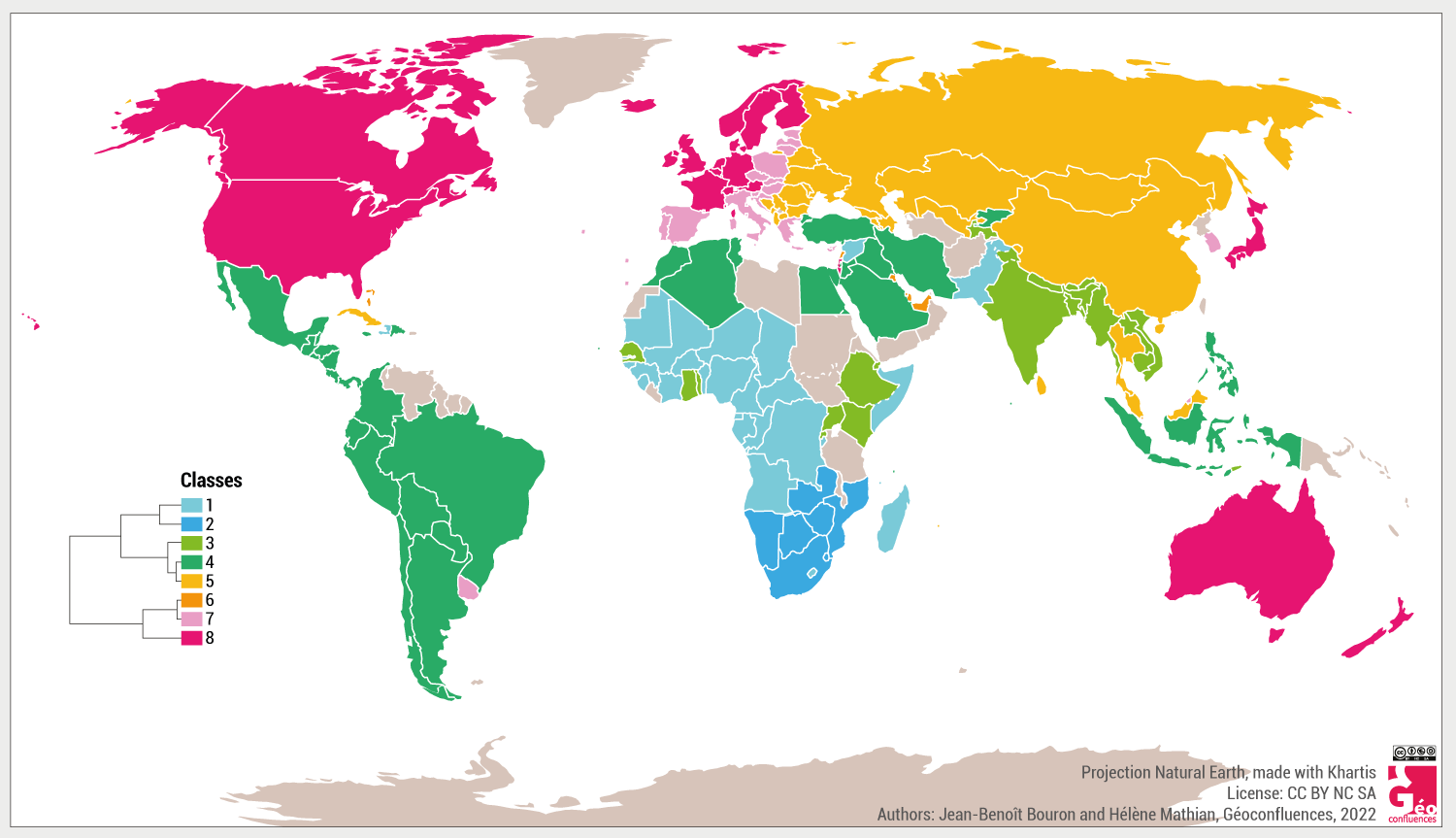
With this procedure, it is also of interest to continue refining the discretization in order to understand certain structures. Each new degree will refine the representation of the world obtained, but one loses ease of interpretation by gaining precision. In the following box, we propose a discretization in two and in eight classes.
|
Conclusion
As overcoming the North-South limit has not so far motivated geographers to suggest a new partition of the world based on levels of wealth and development, we have attempted to describe, with as few and as little transformed indicators possible, the economic and social organisation of the world in the first part of the twenty-first century. It follows several decades of economic crises in the advantaged countries, of battle against poverty in the others. In a third group, the largest, this period has featured the process of development or emergence, often accompanied by a simultaneous increase of the average wealth and of internal inequalities.
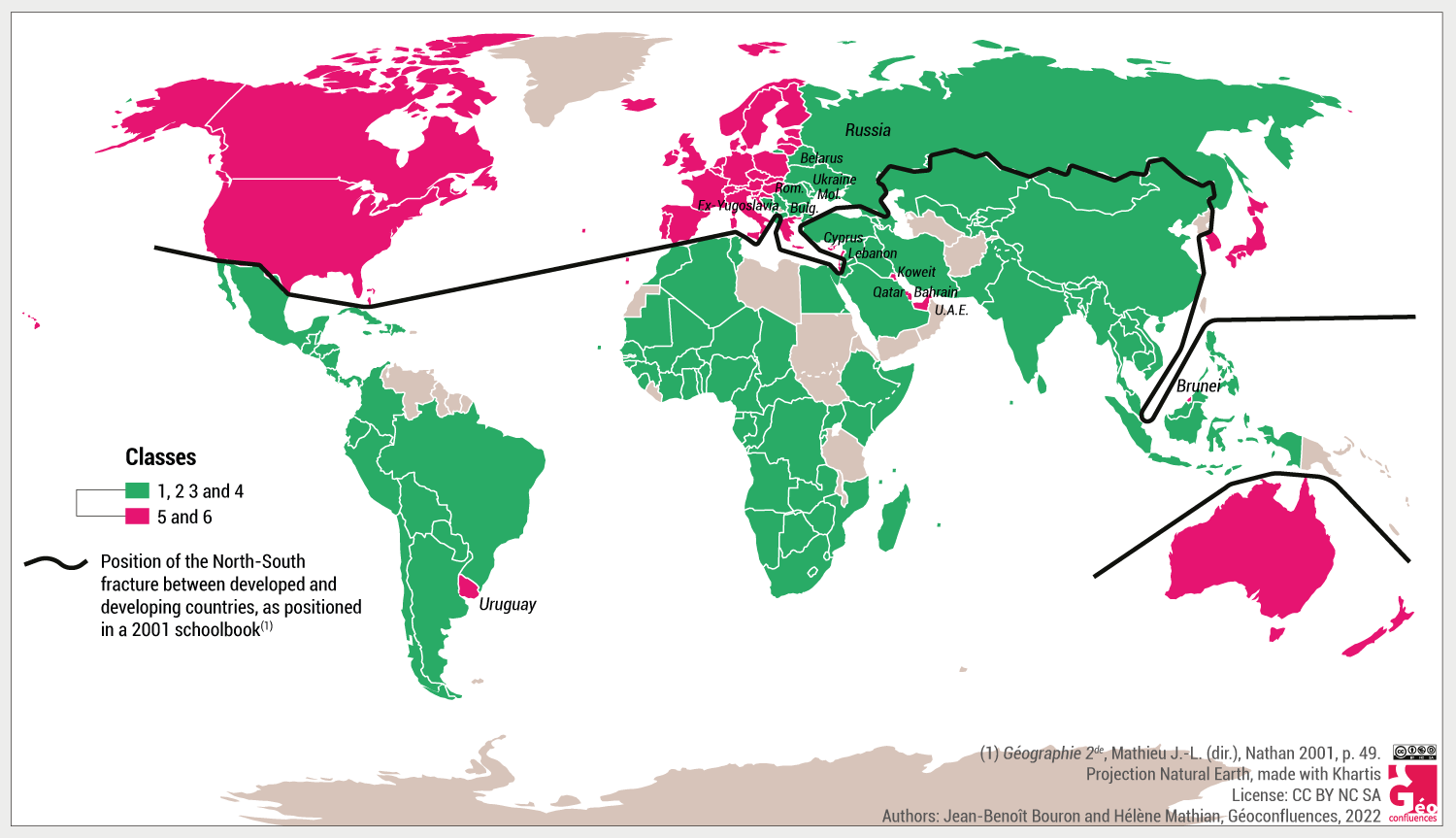
The new partition that we propose presents a world which is no longer divided in two, but in three large groups which are themselves sub-divided into six groups. These groups are not “blocks” but categories established through statistical proximity, statistics being the imperfect reflection of a raw reality, raw like infant mortality rates or the wealth of a population.
They let appear a world in which the advantaged countries form a closed club enjoying the fruits of inherited wealth. This club has an antechamber with peripheries, from those of the EU shaken by crises or recently integrated States to the oil States formerly classified as part of the “South”. In this picture of the world, the emerging countries form a vast entity which contains the majority of the countries and a large part of the world population, with an increasing average wealth, often badly distributed, but which covers an extreme diversity of situations, from the Chinese giant to landlocked countries which are much less connected to globalisation. This ternary description is concluded by a group trapped in precarity and with persistent social and economic difficulties, which comes to show that despite the endeavours of the international institutions, global solidarity is, for now, still nothing but a pious wish. In some of these countries, there is increasing wealth, but it is grabbed by a minority, as can be seen in Southern Africa. We have also shown that the North-South limit, even if its name should no longer be used, has stayed visible on certain maps, in the same way as some borders reappear on themed maps long after they had disappeared.
This work underlines the clear and spectacular geographical recompositions of the world that have taken place in the last four decades. They are closely linked to national or subcontinental trajectories, which form a social, economic and political system. These dynamics are an invitation to rethink the world in its diversity and complexity, by moving from the North-South dualism to a multifunctional global system.
Even though it is distinct from it and cannot be reduced to it, it has its counterpart in the geopolitical sphere and its polynuclear power system. Our work highlights the considerable global progresses achieved by humanity in such a short time, compared to the long periods of the historical scale, and the immense challenges it will have to face in the future in order to ensure truly sustainable, integrating and supportive development.
References
- Sauvy Alfred (1952), « Trois Mondes, une planète », L’Observateur, 14 août 1952, p. 5. Reproduit dans Vingtième siècle, 1986, p. 81-83.
- Brandt Willy, dir. (1980), Nord-Sud : un programme de survie. Rapport de la Commission indépendante sur les problèmes de développement international. Paris: Gallimard, 535 p.
- Capdepuy Vincent (2007), « La limite Nord/Sud », Mappemonde, n° 88, décembre 2007.
- Carroué Laurent (2019), Géographie de la mondialisation. Crises et basculements du monde, Armand Colin, collection « U », 4e éd., Paris.
- Carroué Laurent (2020), Atlas de la mondialisation – Une seule Terre, des mondes, Autrement, collection Atlas, 2e éd., Paris.
- Chancel Lucas (2021) (dir.), Thomas Piketty, Emmanuel Saez et Gabriel Zucman, Rapport sur les inégalités mondiales 2022, Word Inequality Lab, déc. 2021 (voir cette brève)
- Chasles Virginie (2022), « Les inégalités de santé dans les pays émergents, le cas de l’Inde », Géoconfluences, septembre 2022.
- Didelon, Clarisse, Vandermotten, Christian et Dessouroux, Christian, « Un autre monde ? Cartographier le monde sans frontière : enjeux méthodologiques et sociaux ». Comité français de cartographie, n° 234, décembre 2017.
- Dufour, Françoise (2007). « Dire "le Sud" : quand l'autre catégorise le monde », Autrepart, vol. 41, no. 1, 2007, p. 27-39.
- Gambotti Christian (2014), « Gabon, pays émergent. Les ambitions du Plan stratégique Gabon émergent 2025 », Géoéconomie, 2014/1 (n° 68), p. 159-170.
- Grataloup Christian (2015), « Nord / Sud, une représentation dépassée de la mondialisation ? », Les Cafés géographiques, 8 février 2015.
- Guieysse, Jean-Albert, et Thierry Rebour. « Le "ruissellement" des métropoles sur les territoires : mythe ou réalité ? », Population & Avenir, vol. 759, no. 4, 2022, p. 4-7.
- Hugon, Philippe (2005). « Environnement et développement économique : les enjeux posés par le développement durable », Revue internationale et stratégique, vol. 60, no. 4, 2005, p. 113-126.
- Maurin Louis, (1996) « Comment construit-on le PIB ? », Alternatives économiques, décembre 1996.
- Montalieu Thierry (2019), « L’émergence au prisme des agences de notation », Mondes en développement, vol. 186, no. 2, 2019, p. 61-84.
Jean-Benoît BOURON
Agrégé de géographie, responsable éditorial de Géoconfluences (DGESCO, ENS de Lyon)
Laurent CARROUÉ
Inspecteur général de l’éducation, du sport et de la recherche, directeur de Recherche à l’Institut Français de Géopolitique (IFG), Paris VIII
Hélène MATHIAN
Ingénieure de recherche (méthodes en analyse spatiale), CNRS, UMR 5600 EVS (environnement, ville, société), CNRS
Traduction from French by Charlotte MUSSELWHITE-SCHWEITZER
Web layout : Jean-Benoît Bouron
Cite this text:
Jean-Benoît Bouron, Laurent Carroué and Hélène Mathian, « Represent and Partition the World: How to Overcome the North-South-Limit to Think the Inequalities of Wealth and Development », Géoconfluences, December 2022. Translated from French by Charlotte Musselwhite-Schweitzer in April 2023.
URL: https://geoconfluences.ens-lyon.fr/programmes/dnl/dnl-hg-anglais/represent-and-partition-the-world
Pour citer cet article :
Jean-Benoît Bouron, Laurent Carroué, Hélène Mathian, Traduction en anglais : et Charlotte Musselwhite-Schweitzer, « Represent and Partition the World: How to Overcome the North-South-Limit to Think the Inequalities of Wealth and Development », Géoconfluences, avril 2023.
https://geoconfluences.ens-lyon.fr/programmes/dnl/dnl-hg-anglais/represent-and-partition-the-world


